Probabilistic Machine Learning and Weak Supervision
We recently wrote an essay Hand Labeling Considered Harmful about how subject matter and domain experts can collaborate more productively with machines to label data. For example,
There is a growing area of weak supervision, in which SMEs specify heuristics that the system then uses to make inferences about unlabeled data, the system calculates some potential labels, and then the SME evaluates the labels to determine where more heuristics might need to be added or tweaked. For example, when building a model of whether surgery was necessary based on medical transcripts, the SME may provide the following heuristic: if the transcription contains the term “anaesthesia” (or a regular expression similar to it), then surgery likely occurred.
In this technical article, we demonstrate a proof of principle with respect to how humans can collaborate with machines to label training data and to build machine learning models.
We do this in the context of probabilistic labels and predictions, that is, where our model outputs the probability of whether a particular row has a given label, rather than the label itself. As we made clear in Hand Labeling Considered Harmful, establishing ground truth is rarely trivial, if it's even possible, and probabilistic labels are a generalization of categorical labels that allow us to encode the resulting uncertainty.
We introduce three key figures that a data scientist or subject matter expert (SME) can leverage in order to gauge the performance of probabilistic models and use the performance as encoded by the figures to iterate on the model:
- Base rate distribution,
- Probabilistic confusion matrix, and
- Label prediction distribution.
We demonstrate how such a workflow allows humans and machines to do what they're best at. In brief, these figures act as guides for the SME:
- The base rate distribution encodes our uncertainty around the class balance and will be a useful tool as we want our predicted labels to respect the base rate in the data;
- When we have categorical labels, we use a confusion matrix to gauge model performance; now that we have probabilistic labels, we introduce a generalized probabilistic confusion matrix to gauge model performance;
- The label prediction distribution plot shows us the entire distribution of our probabilistic predictions; as we'll see, it is key that this distribution respects what we know about our base rate (for example, if our base rate for 'Surgery' in the above is 25%, in the label distribution we would expect to see ~25% of our dataset with a high chance of being surgery and ~75% of it with a low chance of being surgery.)
Let's now get to work! The steps we'll go through are
- To hand label a small amount of data and establish a base rate;
- Build some domain-informed heuristics/hinters;
- Gauge our model performance by looking at the probabilistic confusion matrix and the label distribution plot;
- Build more hinters in order to improve the quality of our labels.
You can find all the relevant code in this Github repository.
So let's get labeling!
Hand labels and base rates
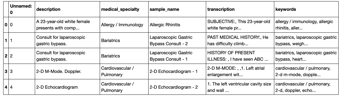
The first step in the workflow is to hand label a small sample of the data. The data we'll be working with here is the medical transcriptions dataset from Kaggle and the task is to predict whether any given transcription involved surgery, as given in the 'medical specialty' column. We'll use this column to hand label several rows, for pedagogical purposes, but this will usually be an SME looking through the transcription to label the rows. Let's jump in and have a look at our data:
<pre><code class="language-python"># import packages and data
import numpy as np
import pandas as pd
import matplotlib.pyplot as plt
import seaborn as sns
import warnings; warnings.simplefilter('ignore')
sns.set()
df = pd.read_csv('data/mtsamples.csv')
df.head()</code></pre>
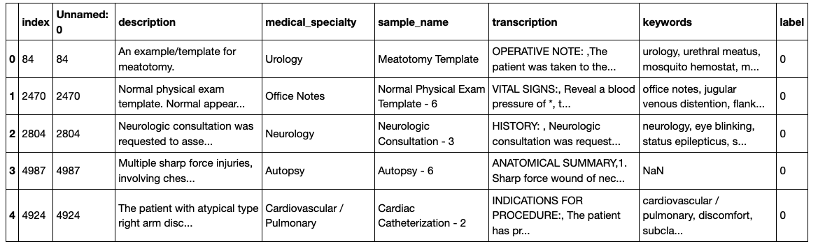
Having checked out our data, let's now hand label some rows, using the 'medical_specialty' column:
<pre><code class="language-python"># hand label some rows
N = 250
df = df.sample(frac=1, random_state=42).reset_index()
df_labeled = df.iloc[:N]
df_unlabeled = df.iloc[N:]
df_labeled['label'] = (df_labeled['medical_specialty'].str.contains('Surgery') == 1).astype(int)
df_unlabeled['label'] = None
df_labeled.head()</code></pre>
These acts of hand labeling serve two purposes:
- to teach us about the class balance and base rate
- to create a validation set
When building our model, it will be key to make sure that the model at least approximately respects the class balance, as encoded in the base rate of these hand labels, so let's calculate the base rate now.
<pre><code class="language-python">base_rate = sum(df_labeled['label'])/len(df_labeled)
f"Base rate = {base_rate}"</code></pre>
<pre><code class="language-python">'Base rate = 0.24'</code></pre>
The Base Rate Distribution
It's now time to introduce the first key figure: the base rate distribution. What do we mean by "distribution" here, given that we have an actual base rate? Well, one way to think about it is that we've calculated the base rate from a sample of the data. This means that we don't know the exact base rate and our uncertainty around it can be characterized by a distribution. One technical way to formulate this uncertainty is using Bayesian techniques and, essentially, our knowledge about the base rate is encoded by the posterior distribution. You don't need to know too much about Bayesian methods to get the gist of this, but if you'd like to know more, you can check out some introductory material here. In the notebook, we have written a function that plots the base rate distribution and we then plot the distribution for the data we hand labeled above (an eagle will notice that we’ve scaled our probability distribution so that it has a peak at y=1; we’ve done so for pedagogical purposes and all relative probabilities remain the same).
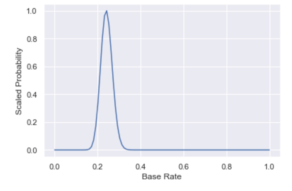
First note that the peak of the distribution is at the base rate we calculated, meaning that this is the most likely base rate. However, the spread in the distribution also captures our uncertainty around the base rate.
It is essential to keep an eye on this figure as we iterate on our model, as any model will need to predict a base rate that is close to the peak of the base rate distribution.
Note that
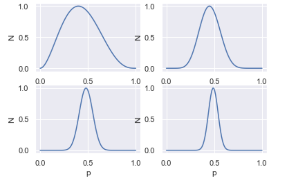
- as you generate more and more data, your posterior gets narrower, i.e. you get more and more certain of your estimate.
- you need more data to be certain of your estimate when $p=0.5$, as opposed to when $p=0$ or $p=1$.
Below, we have plotted the base rate distributions of $p=0.5$ and increasing $N$ (N=5, 20, 50, 100). In the notebook, you can build an interactive figure with a widget!
Machine Labeling with Domain Hinters
Having hand labeled a subset of the data and calculated the base rate, it's time to get the machine to do some probabilistic labeling for us, using some domain expertise.
A doctor, for example, may know that, if the transcription includes the term 'ANESTHESIA', then it's quite likely that surgery occurred. This type of knowledge, once encoded for computation, is known as a hinter.
We can use this information to build a model in several ways, including building a generative model, which we'll do soon. For simplicity's sake, as a first approximation we'll update the probabilistic labels by
- increasing P(Surgery) from the base rate if the transcription includes the term 'ANESTHESIA' and
- doing nothing if it doesn't (we're assuming that the absence of the term provides no signal here).
There are many ways to increase P(Surgery) and, for simplicity, we take the average of the current P(Surgery) and a weight W (the weight is usually specified by the SME and encodes how confident they are that the hinter is correlated with positive results).
<pre><code class="language-python"># Combine labeled and unlabeled to retrieve our entire dataset
df1 = pd.concat([df_labeled, df_unlabeled])
# Check out how many rows contain the term of interest
df1['transcription'].str.contains('ANESTHESIA').sum()</code></pre>
<pre><code class="language-python">1319</code></pre>
<pre><code class="language-python"># Create column to encode hinter result
df1['h1'] = df1['transcription'].str.contains('ANESTHESIA')
## Hinter will alter P(S): 1st approx. if row is +ve wrt hinter, take average; if row is -ve, do nothing
## OR: if row is +ve, take average of P(S) and weight; if row is -ve
##
## Update P(S) as follows
## If h1 is false, do nothing
## If h1 is true, take average of P(S) and weight (95), unless labeled
W = 0.95
L = []
for index, row in df1.iterrows():
if df1.iloc[index]['h1']:
P1 = (base_rate + W)/2
L.append(P1)
else:
P1 = base_rate
L.append(P1)
df1['P1'] = L
# Check out what our probabilistic labels look like
df1.P1.value_counts()</code></pre>
<pre><code class="language-python">0.240 3647
0.595 1352
Name: P1, dtype: int64</code></pre>
Now that we've updated our model using a hinter, let's drill down into how our model is performing. The two most important things to check are
- How our probabilistic predictions match up with our hand labels and
- How our label distribution matches up with what we know about the base rate.
For the former question, enter the probabilistic confusion matrix.
The Probabilistic Confusion Matrix
In a classical confusion matrix, one axis is your hand labels and the other access is the model prediction.
In a probabilistic confusion matrix, your y axis is your hand labels and the x axis is model prediction. But in this case, the model prediction is a probability, as opposed to 'yes' or 'no', in the classical confusion matrix.
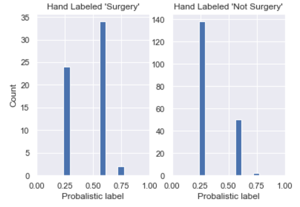
<pre><code class="language-python">plt.subplot(1, 2, 1)
df1[df1.label == 1].P1.hist();
plt.xlabel("Probabilistic label")
plt.ylabel("Count")
plt.title("Hand Labeled 'Surgery'")
plt.subplot(1, 2, 2)
df1[df1.label == 0].P1.hist();
plt.xlabel("Probabilistic label");
plt.title("Hand Labeled 'Not Surgery'");</code></pre>
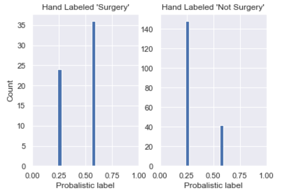
We see here that
- The majority of data labeled 'Surgery' has P(S) around 0.60 (though not by much) and the rest around 0.24;
- All rows hand labeled 'Not Surgery' have P(S) around 0.24 and the rest around 0.60.
This is a good start, in that P(S) is skewed to the left for those labeled 'Not Surgery' and to the right for those labeled 'Surgery'. However, we would want it skewed far closer to P(S) = 1 for those labeled Surgery so there's still work to be done.
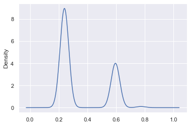
Label Distribution Plot
The next key plot is the label prediction distribution plot across the dataset: we want to see how our label predictions are distributed and whether this matches up to what we know of our base rate. For example, in our case, we know that our base rate is likely somewhere around 25%. So what we would expect to see in the label distribution is ~25% of our dataset with a near 100% chance of being surgery and ~75% of it with a low chance of being surgery.
<pre><code class="language-python">df1.P1.plot.kde();</code></pre>
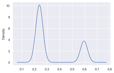
We see peaks at ~25% and ~60%, which means that our model really doesn't yet have a strong sense of the label and so we want to add more hinters.
Essentially, we'd really like to see our probabilistic predictions closer to 0 and 1, in a proportion that respects the base rate.
Building more hinters
To build better labels, we can inject more domain expertise by adding more hinters. We do this below by adding two more positive hinters (ones that are correlated with 'Surgery'), which alter our predicted probability in a manner analogous to the hinter above. See the notebook for the code. Here are the probabilistic confusion matrix and the label distribution plot:
Two things have happened, as we increased our number of hinters:
- In our probabilistic confusion matrix, we've seen the histogram for those hand labeled 'Surgery' move to the right, which is good! We've also seen the histogram for hand labeled 'Surgery' move slightly to the right, which we don't want. Note that this is because we have only introduced positive hinters so we may want to introduce negative hinters next or use a more sophisticated method of moving from hinter to probabilistic labels.
- Our label distribution plot now has more density above P(S) = 0.5 (more density on the right), which is also desirable. Recall what we would expect to see in the label distribution is ~25% of our dataset with a near 100% chance of being surgery and ~75% of it with a low chance of being surgery.
Generative models for hinters
Such hinters, although instructive as toy examples, can only be so performant. Let's now use a larger set of hinters to see if we can build better training data.
We'll also use a more sophisticated method of moving from hinter to probabilistic label: instead of averaging over a weight and previous probabilistic prediction, we'll use a Naive Bayes model, which is a generative model. A generative model is one that models the _joint probability_ $P(X, Y)$ of features $X$ and target $Y$, in contrast to discriminative models that model the conditional probability $P(Y|X)$ of the target conditional on the features. A strength of using a generative model, as opposed to a discriminative model like a random forest, is that it allows us to model the complex relationships between the data, the target variable, and the hinters: it allows us to answer questions such as "Which hinters are noisier than the others?" and "In which cases are they noisy?" For more on generative models, Google has a nice introduction here.
To do this, we create arrays that encode whether or not a hinter is present, for any given row. First, let's create lists of positive and negative hinters:
<pre><code class="language-python"># List of positive hinters
pos_hinters = ['anesthesia', 'subcuticular', 'sponge', 'retracted', 'monocryl', 'epinephrine',
'suite', 'secured', 'nylon', 'blunt dissection', 'irrigation', 'cautery', 'extubated',
'awakened', 'lithotomy', 'incised', 'silk', 'xylocaine', 'layers', 'grasped', 'gauge',
'fluoroscopy', 'suctioned', 'betadine', 'infiltrated', 'balloon', 'clamped']
# List of negative hinters
neg_hinters = ['reflexes', 'pupils', 'married', 'cyanosis', 'clubbing', 'normocephalic', 'diarrhea', 'chills', 'subjective']</code></pre>
For each hinter, we now create a column in the DataFrame encoding whether the term is in the transcription of that row:
<pre><code class="language-python">for hinter in pos_hinters:
df1[hinter] = df1['transcription'].str.contains(hinter, na=0).astype(int)
# print(df1[hinter].sum())
for hinter in neg_hinters:
df1[hinter] = -df1['transcription'].str.contains(hinter, na=0).astype(int)
# print(df1[hinter].sum())</code></pre>
We now convert the labeled data into NumPy arrays and split it into training and validation sets, in order to train our probabilistic predictions on the former and test them on the latter (note we're currently using only positive hinters).
<pre><code class="language-python"># extract labeled data
df_lab = df1[~df1['label'].isnull()]
#df_lab.info()
# convert to numpy arrays
X = df_lab[pos_hinters].to_numpy()
y = df_lab['label'].to_numpy().astype(int)
## split into training and validation sets
from sklearn.model_selection import train_test_split
X_train, X_test, y_train, y_test = train_test_split(
X, y, test_size=0.33, random_state=42)</code></pre>
We now train a Bernoulli (or Binary) Naive Bayes algorithm on the training data:
<pre><code class="language-python"># Time to Naive Bayes that shit!
from sklearn.naive_bayes import BernoulliNB
clf = BernoulliNB(class_prior=[base_rate, 1-base_rate])
clf.fit(X_train, y_train);</code></pre>
With this trained model, let's now make our probabilistic prediction on our validation (or test) set and visualize our probabilistic confusion matrix to compare our predictions with our hand labels:
<pre><code class="language-python">probs_test = clf.predict_proba(X_test)
df_val = pd.DataFrame({'label': y_test, 'pred': probs_test[:,1]})
plt.subplot(1, 2, 1)
df_val[df_val.label == 1].pred.hist();
plt.xlabel("Probabilistic label")
plt.ylabel("Count")
plt.title("Hand Labeled 'Surgery'")
plt.subplot(1, 2, 2)
df_val[df_val.label == 0].pred.hist();
plt.xlabel("Probabilistic label")
plt.title("Hand Labeled 'Not Surgery'");</code></pre>
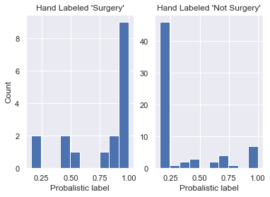
This is cool! Using more hinters and a Naive Bayes model, we see that we've managed to increase the number of true positives _and_ true negatives. This is visible in the plots above as the histogram for the hand label 'Surgery' is skewed more to the right and the histogram for 'Not Surgery' to the left.
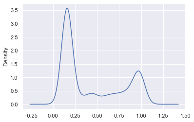
Now let's plot the entire label distribution plot (to be technically correct, we would need to truncate this KDE at x=0 and x=1 but, for pedagogical purposes we’re fine as this wouldn’t change a great deal):
<pre><code class="language-python">probs_all = clf.predict_proba(df1[pos_hinters].to_numpy())
df1['pred'] = probs_all[:,1]
df1.pred.plot.kde();</code></pre>
When to stop labeling
If you're asking "When is it time to stop labeling?", you're asking a key and fundamentally hard question. Let's decouple this into 2 questions:
- When do you stop hand labeling?
- When do you stop the whole process? I.e. When do you stop creating hinters?
To answer the first, at a bare minimum, you stop hand labeling when your base rates are calibrated (one way to think about this is when your base rate distribution stops jumping around). Like a lot of ML, this is in many ways more of an art than a science! Another way to think of this would be to plot a learning curve of base rate against size of labeled data and stop once it plateaus. Another important factor in considering when you’re done hand labeling is when you feel that you’ve achieved a statistically significant baseline so that you can determine how good your programmatic labels are.
Now when do you stop adding hinters? This is analogous to asking "When are you confident enough to start training a model on this data?" and the answer will vary from scientist to scientist. You could do it qualitatively by scrolling through and eyeballing but most scientists would prefer a quantitative method. The easiest way is to calculate metrics such as accuracy, precision, recall, and F1 score of your probabilistically-labeled data against your hand-labeled data and the lowest lift way of doing this is by using a threshold for your probabilistic labels: for example, a label of < 10% would be 0, > 90% 1, and anything in between abstention. To be clear, such questions are also still active areas of research at Watchful... Watch this space!
Many thanks to Eric Ma for his feedback on a working draft of this post.